Reynard
aka Ian Eller
Yes. Still involves screaming, even...Is that like a reverse Peewee’s Playhouse situation…?
Yes. Still involves screaming, even...Is that like a reverse Peewee’s Playhouse situation…?
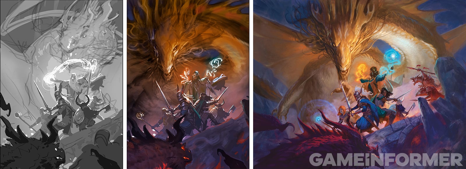
The Cover Art for the PHB shows the new look for the Gold Dragon


It's supposed to look like an Eastern Dragon.Yeah, I feel the same way. Variety is the spice of life. Anyway, the dragons in my campaign look like whatever miniature I am currently jonesing to use. So if that makes the villain a gold dragon, that's just how it is.
On an aesthetic level, I prefer my dragons to look reptilian. The one from the new PHB art looks too much like a lion for my taste. It's not a miniature I would buy.


I like them both. I have no issues with the bronze, but I would make a few changes to the red. They are my favorite D&D dragons so I am more particular about them. I may take the concept image into GIMP and see what I can do with it.So the titular monsters of Dungeons and Dragons are getting a full visual redesign! The dragons have had a consistent design since 3rd edition, so I was pretty shocked when I heard that they were being redone. However when I saw them I instantly loved them. More than ever before they feel like real flesh and blood monsters, and the design both resembles their previous iteration, while being a lot more distinctive than before.
I'm still hoping that their statblocks get redone to be worthy of both the namesake of DnD, and one of the most commonly used BBEGs in peoples campaigns. 'Big blob of health which occasionally does fire damage' isn't exactly a memorable encounter.
What do people think of the new designs?
Wouldn't be against bringing back some of the more obscure chromatic/metallic/gem dragons, to say nothing of lung dragons, linnorms, 4e cataclysmic dragons, etc.These are certainly the best dragons since the 3E Draconomicon, which remains the high water mark for me. I kind of wish they'd waited to do Fizban's after the 2025 Monster Manual, but I'm sure it won't be the last dragon-centric book published by WotC.
We actually did get pictures of the updated designs for the other Chromatics.
Let me post them again.
