Have you backed a campaign run purely on Backerkit? The fulfillment end is great, I agree, but their version of the user-facing side of Kickstarter is pretty lackluster, with information often harder to find, no automatic nag button to prompt updates 30 days after the last update from the campaign, and the overall page organization is poor. And discovery through the front page isn't nearly as good.
Backerkit decided to compete directly with Kickstarter, but their UI people don't seem to have actually looked at the Kickstarter site and see what it offers. The result is a page that feels like a beta, but which has hung around for an awful long time without improvements.
Fair enough. Perhaps Kickstarter is better for engagement, but I can't really comment. I generally don't engage in comments and really only check on status of my backed projects every month or so. I read any updates as I get them by e-mail most of the time. When I used to rubber-neck the comments threads on lagging or failed campaigns on Kickstarter, the nag-for-an-update button never seemed to make much of a difference.
Out of curiosity I just loaded both BackerKit and Kickstarter in side by side windows on my screen. After comparing the two, I have to say that I now agree with you. I think Kickstarter's interface provides a superior backer experience, with one very important exception--fulfillment. Bakerkit is MUCH more customer friendly for managing your pleges, tracking order status, and updating your deliver address (as you acknowledged in your post). Below are the results of my side-by-side comparison.
Home/Front page. For me both are similar. Highlighting new projects, most successful projects, projects their algorithms think I might be interested in. Backer kit has some more interactive elements like polls. Mostly I find find neither particularly useful for me personally and I generally spend little time on the front pages of these sites. Both have a user icon to access your account info in the upper right of the page with a search icon next to it. Kickstarter has a prominent link at the top of the site to "Start a Project" for creators. Bakerkit doesn't. Doesn't matter for me as a 100% baker/consumer. Bakerkit has a mountain icon acting as the home button for the top navigation. Kickstarter uses it logo. Kickstarter has a clear "discover" text link with some of the more popular categories listed in a horizontal text menu. Bakerkit has a hamburger icon you have to click on to pull up the discover menu. The former may be a bit more convenienct with one less click, but the later gives a cleaner and less messy page design. I find both pretty much the same, with a slight preference for Bakerkit. But I don't find either ideal. I would prefer highlighting the status of projects I'm currently backing right on the home page, but I understand why they want to use this space to advertise and entice you to click on new projects.
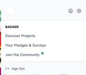
Account drop-down menus. When you click on your account icon in the upper-right of the screen for both site, it opens a drop-down to access status of your current project, account info, etc. For me, Kickstarter is the clear winner here, mostly because it will list your most recently backed projects right in this lisk. Which can save a click. Also, Kickstarter allows you to quickly jump to your messages and recent backed-campaigns activity feed right from the menu. Backerkit's drop down is "cleaner" but Kickstarter's is more convenient. For me Kickstarter is the better UI for me in this respect.
Backerkit's account drop-down menu on left, Kickstarter's on the right.
All Pledges/Backed Projects Pages.
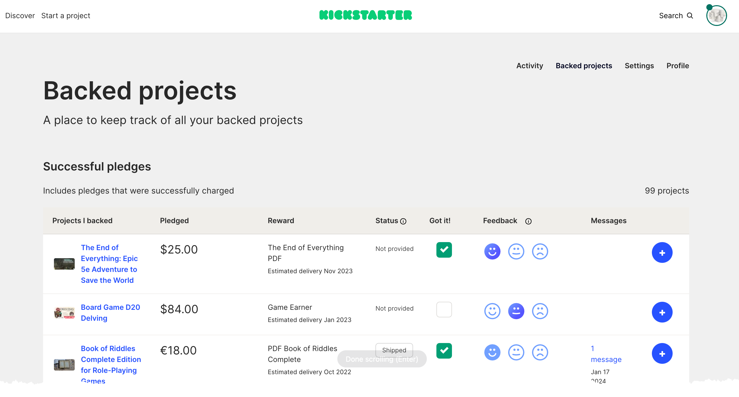
Kickstarter is the clear winner for me. Backerkit lists the projects but it is not interactive or useful beyond a click-through list. The Kickstarter list how has features that allow you click and confirm which projects you have received, making it a checklist of sorts and making it easier to know which projects you may want to keep an eye on and check up on. It also alerts you of any new direct messages from that project that you can click through to the message directly. Backerkit doesn't even have an in-site direct creator-to-backer messaging feature. Perhaps they find the project updates on the project page plus e-mail messages sufficient. But I've found the Kickstarter messaging feature to be very helpful over the years. The Kickstarter list also allows you to show how you feel about each project. I have no idea how impactful that is, but I do use it.


Project Pages. The pages with the project details, project updates, your pledge details, and comments. Kickstarter is a much more pleasant layout and much easier to navigate. Bakerkit's project pages are serviceable, but look messier. I much prefer reading about projects and following updates on on the Kickstarter pages than the Bakerkit pages. I also like having comments in a separate tab. It is just cleaner. Not a big deal for me as I'm not spending a lot of time interacting with the project pages after I've backed a project, but Kickstarter is the clear winner her for me. I'm not giving screenshots here as I would have to give multiple large, long scroll captures or videos to give a good comparison.
Fulfillment Tracking. Bakerkit is the clear winner here, because Kickstarter really doesn't offer this, except when creators deliver product via special links shared through direct messages. Most of the Kickstarter projects I back use Backerkit for fulfillment. I can click directly to deliver information, surveys, update my delivery information, etc. all from links from Backerkit project pages. Or I can go to "My Surveys" page in Bakerkit and see a list of my projects in BOTH Bakerkit AND all the Kickstarter projects I've back that use Bakerkit for fulfillment and see my order status. I can also update my shipping address for ALL outstand projects at once. It is a huge convenient. In Kickstarter for nearly any project I check I see people asking about how to update their address because they've moved since backing a project, asking about shipping status, and all of that has to be handled by project updates, FAQs, and comments, usually with links and instructions for other fulfillment websites, usually Bakerkit. Bakerkit is the clear winner here and it is a big advantage addressing a common point of confusion and frustration for backers on Kickstarter.


