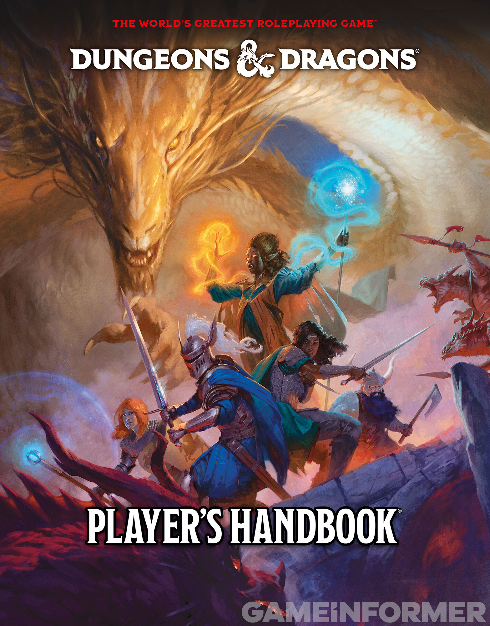
Re: the cover, I think the appropriate response is:
It's a D&D PHB cover.
I have never liked a D&D PHB cover in an artistic/aesthetic sense.
I have always liked D&D despite a lot of mediocre or even truly terrible or actively off-putting cover art - very different to say, Shadowrun, which absolutely sold the game to me entirely on the 1E cover art, for example. The absolute nadir for me is 3E's hideous and hilarious art-project-style covers, which always reminded me of something which would get like a B- at A-level art or something.
This is... it's better than that! It's better than the 5E 2014 cover! It's slightly better than the 4E PHB1 cover because that was just so boring, at least there's a bit of a story here. I'd say it's not quite as arresting as the 2E or 1E covers, and a little bit twee, but most people seem to play D&D a little bit twee these days, so perhaps that's fitting.
I do appreciate putting TWO black characters dead-centre. That's a mission statement for you. Two black or black-adjacent characters on the cover alone is a bold move in a world full of haters and knee-jerkers. Undermining this somewhat is everyone except the centre lady (a mage?) is just very bog-standard, with the most stereotypical dwarf possible and the ranger is so stereotypical you can not only tell she's a ranger, but you wonder if she's cosplaying Ranger from the D&D cartoon.
So I guess it is actually the least-worst WotC D&D cover. But it is still very much a D&D cover with all that entails - but I couldn't/shouldn't have expected anything different.


